ITERATION OF BACKGROUND
Pain Point
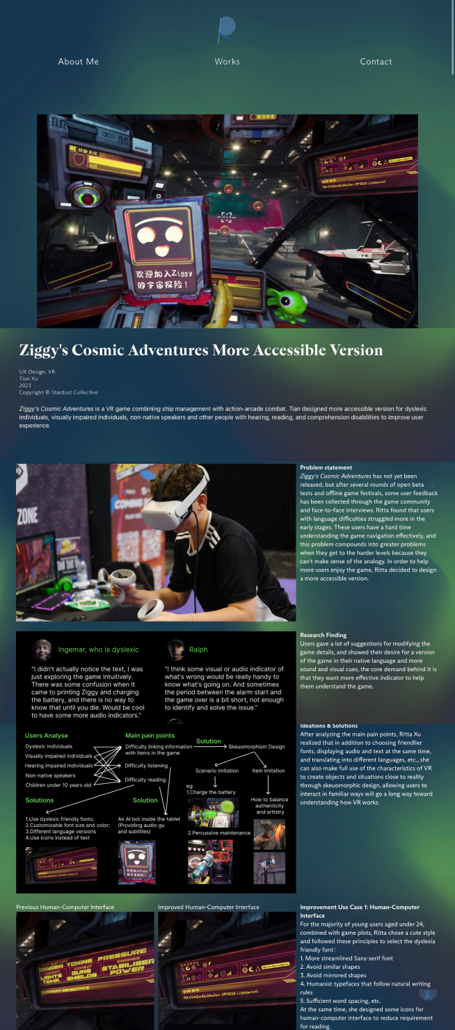
In the initial version, the work details page had a plain black background, which did not effectively complement each work's theme or add a sense of artistry to the overall design. This lack of visual cohesion made it challenging for users to connect with the artistic essence of each piece.
Before
![]()

After
![]()

Iteration 1
I extracted the theme color of each work and introduced a dynamic gradient background, enhancing the page layout with a visually appealing and cohesive design.
Usability Testing
After user testing, feedback indicated that the readability of words displayed on a dynamic background was insufficient, and the lack of clear boundaries between each section made users impatient to continue reading.
Before
![]()
In progress
![]()

After
![]()

Iteration 2
For accessibility considerations, I implemented stacks to differentiate various sections on the design works' details page. Additionally, I inserted some parallax scrolling sections to serve the purpose of division and overall cohesion. For design works with extensive text and information, this approach allows for clear and coherent storytelling. Conversely, for art pieces with fewer words and more images, the dynamic background was retained to emphasize their artistic nature, aligning with the style of the artworks.