USE CASE 1: HUMAN-COMPUTER INTERFACE
Before

Pain point
In the previous Human-Computer Interface, prioritizing design aesthetics resulted in the selection of a visually appealing but less readable font. This created challenges for non-native English speakers and individuals with dyslexia, as the plain English text became less user-friendly and harder to comprehend.
After
![]()
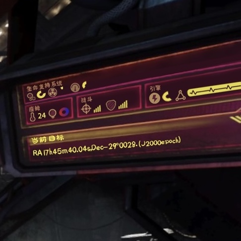
Improvement
For the majority of young users aged under 24, combined with game plots, I chose a cute style and followed these principles to select the dyslexia friendly font:
1. More streamlined Sans-serif font
2. Avoid similar shapes
3. Avoid mirrored shapes
4. Humanist typefaces that follow natural writing rules
5. Sufficient word spacing, etc.
Furthermore, Tian designed icons for the interface and mimicked a car's dashboard in the spaceship cabin to enhance users' understanding of VR games through familiarity.